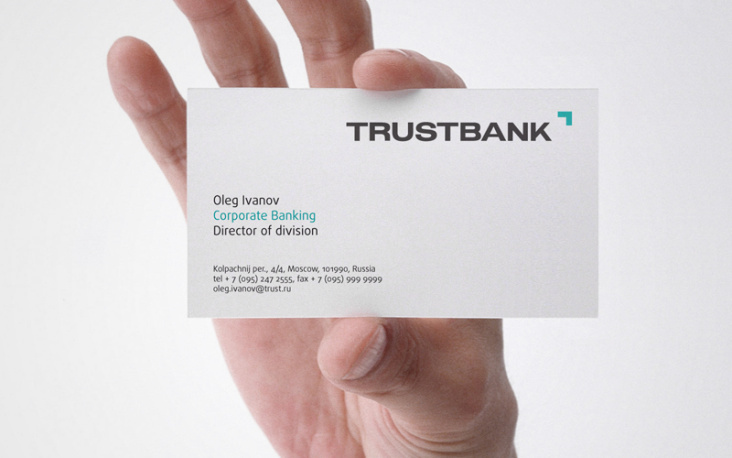
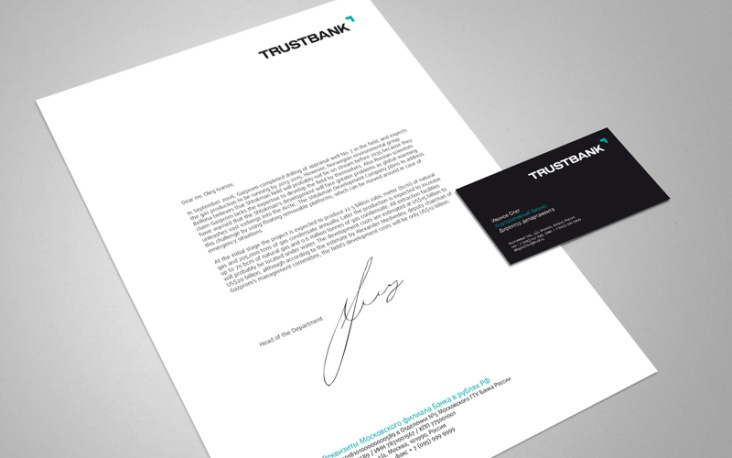
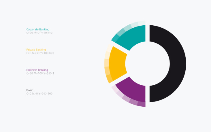
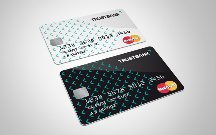
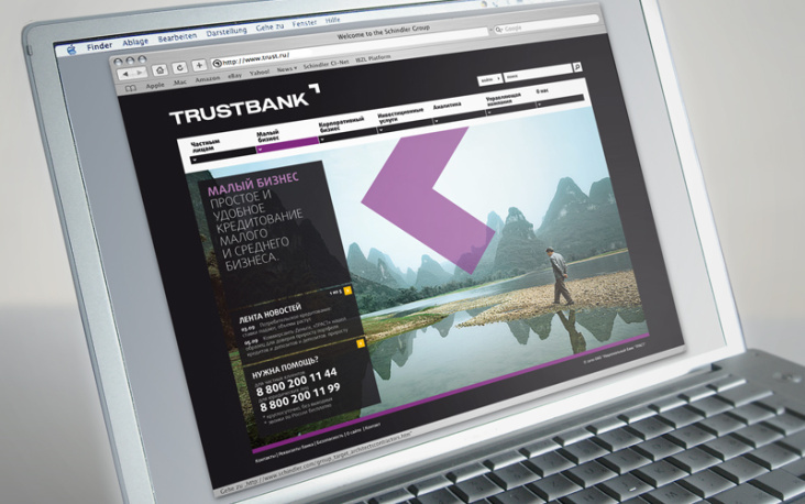
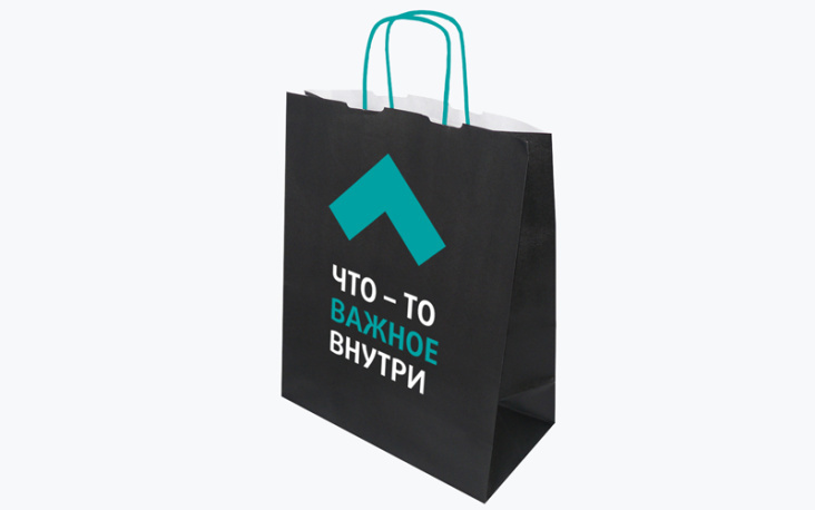
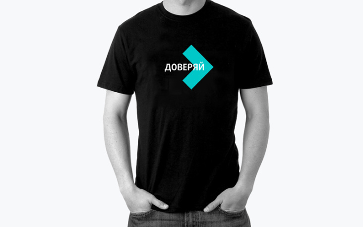
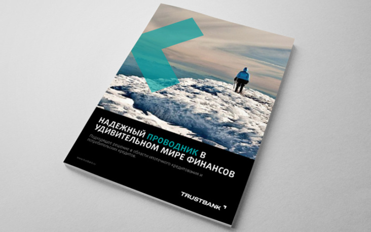
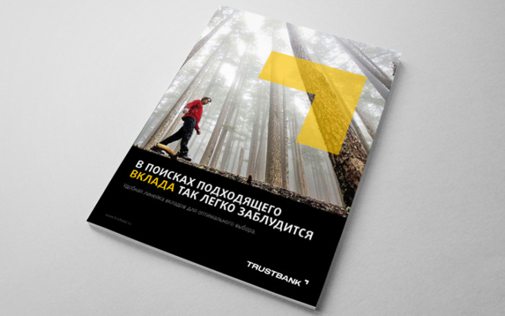
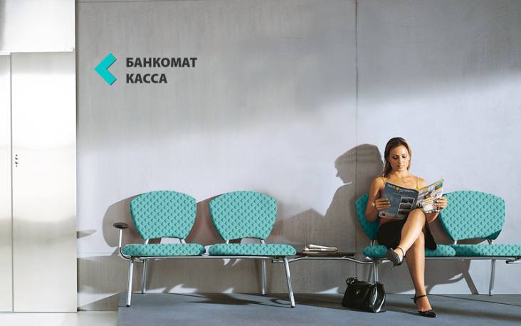
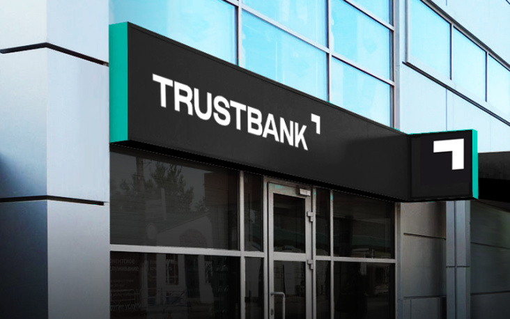
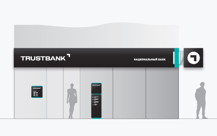
The national bank “Trust” is one of the 30 biggest banks of Russia. We had to redesign a logo of a modern, user-friendly bank, but save the maximum of its recognizability. The second goal was to get away from monochrome „TRUST“ and make the logo bright while leaving it in the perception of people in black and white. It was impossible to create a Cyrillic version of the logo by taking the symmetry of the English version because of a half of Cyrillic “T” must be read as “G”. It was therefore decided to divide the corporate writing and the graphic symbol. We reduced the degree of „luxury“ by expansion of the black-and-white palette with the basic warm turquoise colour and three additional colours.